
Project: SAM Companion App
Role: UX/UI Design, Research
Duration: January 2023 (3 weeks)
Project Vision
Going to the art museum can be overwhelming—while taking in the sights, visitors must navigate through a maze of exhibition spaces without any clear guidance or goals. One can spend hours at the museum and leave unfulfilled. The Seattle Art Museum Companion App aims to fix this by providing users with a digital map, curated tours, and customized recommendations. Visitors can use the app to both plan their visits ahead of time and easily navigate through the museum.
Challenges
1) Organize and catalogue SAM's nearly 25,000 works
2) Design an interface useful for both members and first time visitors
3) Create a color scheme that allows artwork to pop
4) Provide a cohesive system for users to save artwork they like


Kickoff
During my first visit to the Seattle Art Museum, I found myself constantly buried in my phone. Whether I was googling works, browsing the museum's website, or pulling up navigation, I felt anchored to but inconvenienced by my device. I decided to design a companion app for the museum that would streamline and enhance the visiting experience. After interviewing five participants and establishing archetypes, it became clear that such an app would solve many if not all the common problems faced by museum visitors. Going forward, I used primarily qualitative research methods to pinpoint the ways in which this app could truly serve as an essential companion for its users.
User Research
After conducting some initial interviews, I narrowed user concerns down to four key pain points:

Accessibility
Visitors with difficulty reading the placards aren’t able to enjoy the museum to the same extent as other guests.

Navigation
Some visitors experience difficulty with finding their way around the museum.

Lack of info
Those with a deeper interest in art desire more information about pieces or artists they resonate with.

FOMO
Visitors are frustrated when they miss key exhibits that they would have wanted to see.
Meet the Users

Name: Myra
Age: 43
Occupation: Stay-at-home parent
For Myra, a stay-at-home parent with a light interest in art, the museum is a fun day-trip destination for the family. She enjoys looking at paintings but finds she doesn’t quite connect with them or know where to begin. Wanting to learn more, Myra often uses her phone to look up artists she enjoys, but this takes time and she needs to also keep her kids engaged. Additionally, Myra finds the museum maps to be overwhelming and confusing—especially for someone who isn’t familiar with art terminology.

Name: Evie-Mae
Age: 25
Occupation: PhD Student
Evie-Mae is a student pursuing her PhD in Art History. For her, the museum is a place where she can go not only to unwind, but to discover new works by the latest up and coming artists. Evie-Mae’s problem is that she often wants to dig deeper on works she resonates with but doesn’t have the time to do so—and while the descriptive plaques are helpful, she wants more detail (and hates awkwardly blocking the view while she stands in front processing information).

Name: Dave
Age: 31
Occupation: Engineer
Dave is a tourist and wants to visit the Seattle Art Museum. This will likely be the only time he ever visits, and so he wants to make it count. The options are overwhelming though—there are a seemingly infinite amount of exhibits and works he can see, but he also doesn't want to spend the whole day there! (After all, there's a whole city to explore). How can Dave experience the best that the Seattle Art Museum has to offer?
Information Architecture
SPLASH SCREEN
-
I'm at the museum
-
Just browsing
MAP
-
Points of interest
-
Restrooms
-
Gift shops
-
Food/drinks
EXPLORE
-
For you
-
Tours
-
Exhibits
-
Works
FAVORITES
-
Saved works
MENU
-
Visitor info
-
Tickets
-
Programs
-
Settings
WORK/EXHIBIT
-
Find on map
-
Favorite
-
Share
TOUR
-
Start tour
SETTINGS
-
Reset data
-
Light/dark mode

Wireframes
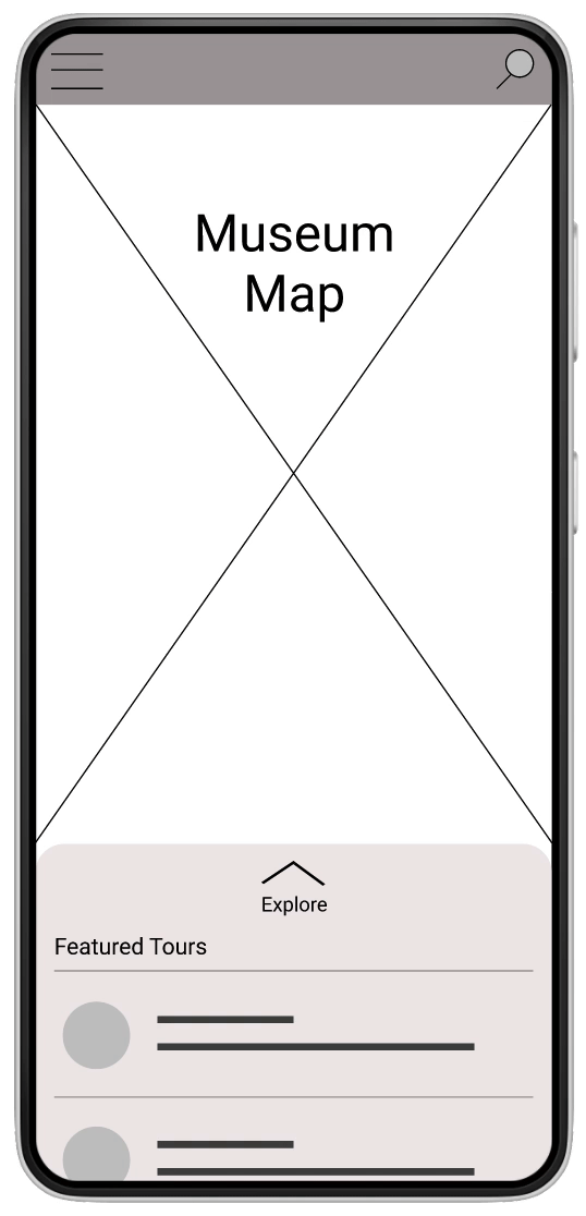
Initially, my design prioritized the museum's map and included a tab that would slide up from the bottom with specific information about works, exhibits, and tours.
While this tab was initially meant to entice viewers to find new content, it didn't give them enough control over their browsing experience. Additionally, it wasn't always clear whether viewers were looking at a curated tour, exhibit, or single work. This was updated in the next prototype iteration.
In contrast, some layout choices worked very well in testing. Users gravitated towards the search icon at the top of their screen, as it allowed them to easily look up works or exhibits by title, artist name, date created, region, etc. Allowing users to quickly find what they need is of course a key objective of this app, but I wanted the next iteration to allow users to more easily discover new content.
Iterations
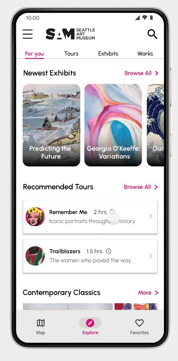
The final design ditched the tab layout in favor of a more traditional navigation menu at the bottom. This way, the app gives equal weight to the map, explore, and favorites pages. A clean and simplistic design makes the art pop, drawing the user into discovering new works.
The "for you" page will display content based on the user's preferences. There will be a brief questionnaire when users open the app for the first time, asking them what styles and mediums of art they are interested in. These preferences evolve based on how the user browses the app, and can be easily changed in the settings menu.
Users can now also browse specifically for tours, exhibits, or works in clearly designated tabbed categories.
Final Design
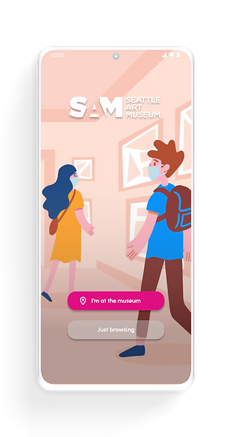
Splash Screen
Allowing users to jump in without doing a location check ensures a smooth experience right away.

Map
The map guides users to points of interest. A carousel of key locations at the top makes navigating even easier.
Explore

The "for you" section highlights works, artists, and exhibits that line up with the user's preferences.

Favorites
Here, users can check out their saved art and rearrange their collection.

Exhibit Page
The exhibit page provides a clean and concise overview, as well as a gallery of the works included that users can browse.

Work Page
It was important that this page had a number of launching points for users to explore elsewhere. They can click on a tag, the artist, or see "more like this."

Tour Page
Before starting their curated tour, users can browse through the stops and even skip around. Audio guides provide an immersive experience.

Search Page
The search page, accessed from almost every other page, is key to the flow of this design. Users will be spending a lot of time here.

Navigation Drawer
A simple navigation drawer provides a few extra options that will make the user's museum experience easier.